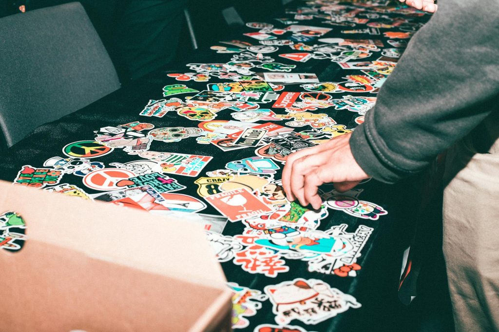
Hello everyone! I want to discuss an important issue that has been arising with my clients: designing files for small sticker printing. Recently, a client sent me a file to be printed on a 7cm round sticker. Unfortunately, some letters and figures didn’t come out clearly because they were too small from the onset. To help you avoid similar issues, I will provide a comprehensive guide on how to design graphics for small stickers.
Use Vector-Based Software
First and foremost, it is crucial to use vector-based software for your designs. Programs like Adobe Illustrator, CorelDRAW, or Inkscape create vector graphics that can be scaled to any size without losing quality. This is essential for printing, especially small stickers because vector graphics maintain crisp lines and clear details.
Why Vectors Matter
Vectors are made up of points, lines, and curves that are mathematically defined, which means they don’t lose quality when resized. On the other hand, pixel-based graphics (like those made in PixelLab) can become pixelated and blurry when scaled. This was the issue with my client’s design—it was created in PixelLab, so the graphics were already pixelated when the file was sent over for printing.
According to Adobe, vector graphics are ideal for projects that require scalability and high-quality output, such as logos and stickers.
Choose the Correct Color Mode
When preparing your design, always work in CMYK color mode. CMYK stands for Cyan, Magenta, Yellow, and Key (Black), which is the standard color mode used in printing. If you design in RGB (Red, Green, Blue), intended for screens, the colors may not print correctly. For instance, blacks can appear washed out or too light.
Why CMYK Is Important
CMYK provides a more accurate representation of how colors will appear when printed. Using RGB might result in unexpected color shifts, especially with dark colors. By starting with CMYK, you ensure that what you see on your screen is closer to what you’ll get in print.
As noted by Pantone, converting designs from RGB to CMYK is crucial for achieving accurate color reproduction in printed materials.
Select the Right Fonts
The size of your sticker means that the fonts you choose are critical. Here are some tips to ensure your text remains legible:
- Use Bold Sans Serif Fonts: These are easier to read in smaller sizes. Fonts like Arial, Helvetica, or Roboto are excellent choices.
- Font Size: Make sure that any vital information is written in bold fonts and is at least 12 points in size. Smaller fonts can become indistinct and hard to read.
- Business Name Flexibility: Since your business name is generally more prominent, you can use any font. However, ensure it’s still legible and fits well with the overall design.
According to Typography.com, bold sans serif fonts are more readable in smaller sizes, making them a perfect choice for small stickers.
Ensure High Contrast
Contrast is another critical factor. Your text should stand out against the background to ensure readability. Here’s how to achieve this:
- Dark Text on Light Background: If you choose dark colors for your text, ensure the background is light.
- Light Text on Dark Background: If your background is dark, like black, the text should be bold and lighter in color.
- Avoid Homogeneous Colors: Don’t use colors that are too similar; there should be a clear distinction between the text and the background to avoid any readability issues.
Use High-Quality Images
If your design includes images, make sure they are high-quality. Low-resolution images can look pixelated and unprofessional when printed, especially on small stickers. Here are some tips for using images:
- High-Quality Sources: Use free high-quality image sources like Pixabay, Unsplash, Pexels, and Freepik. These platforms offer a wide range of images that you can use for your designs.
- Check Resolution: Ensure the images have a high resolution (at least 300 DPI) to maintain clarity when printed.
Save and Send High-Quality Files
When your design is complete, save it in a high-quality format. Increase the DPI (dots per inch) to ensure clarity, if possible. Here are some recommended file formats:
- Vector Files: If possible, send your files in vector format. Common vector file formats include SVG, EPS, CDR, and PDF. These formats are widely supported by various design software.
- High-Resolution Formats: If you must send pixel-based graphics, ensure they are high-resolution. Formats like PNG or high-resolution JPEGs can work, but vector is always preferred.
Why File Quality Matters
Sending high-quality files ensures that the details in your design are preserved and look crisp and professional when printed. Low-quality files can result in blurry, pixelated prints that detract from the overall appearance of your stickers.
Summary of Tips for Designing Small Stickers
To wrap up, here’s a quick summary of the tips for creating effective designs for small stickers:
- Use Vector-Based Software: Create your designs in programs like Adobe Illustrator, CorelDRAW, or Inkscape to avoid pixelation.
- Work in CMYK Color Mode: Ensure accurate color representation in your prints.
- Choose Legible Fonts: Use bold sans serif fonts and ensure that important text is at least 12 points in size.
- Ensure High Contrast: Ensure your text stands out against the background for readability.
- Use High-Quality Images: Source high-resolution images from platforms like Pixabay, Unsplash, Pexels, and Freepik.
- Save and Send High-Quality Files: To maintain detail and clarity in your prints, use vector formats or high-resolution pixel-based formats.
By following these guidelines, you’ll create designs that look great on small stickers and print beautifully. If you need help with your design or have questions, don’t hesitate to contact Lampmediatouch for professional design and printing services. Whether you need assistance creating your design or are ready to send over your files for printing, we’re here to help. Happy designing!