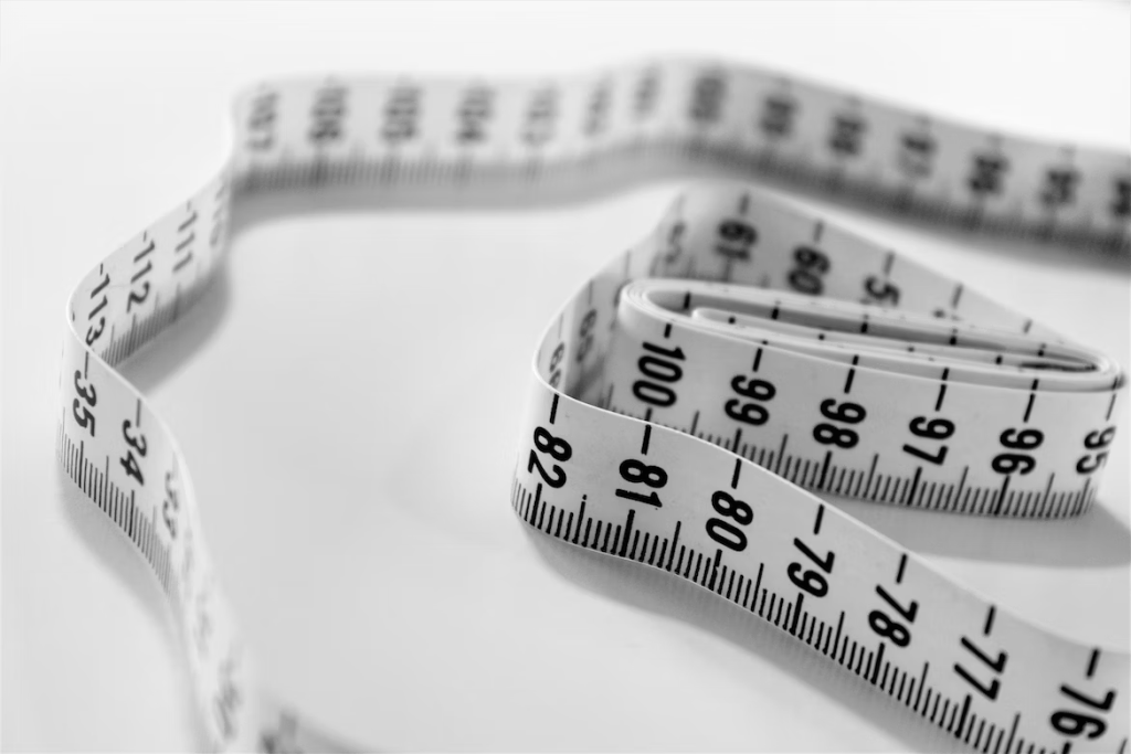
If you are a graphic designer or a client who needs graphic design services, you might have encountered the terms dimension and size. But do you know what they mean and how they affect your design projects? Several times our clients are so confused about what these two really mean. Especially when they take picture of a particular banner and send it to us to give them the price. Simply put, we will just start to educate them. In this article, we will explain the difference between dimension and size in graphic design and why it matters.
What is dimension in graphic design?
Dimension refers to the numerical value that defines the size, shape, location, surface texture, or geometric characteristics of a feature. For example, the dimension of a circle can be expressed by its diameter, radius, circumference, or area. The dimension of a rectangle can be expressed by its length, width, height, or diagonal.
Dimension is also related to the principle of scale in graphic design. Scale refers to the relative size of a design element in comparison to another element. For example, in the famous Volkswagen ad “Think small”, the car is small in relation to the white space of the ad. This creates a contrast and draws attention to the message.

What is size in graphic design?
Size refers to the physical measurement of an object or a design element. Size can be expressed in different units, such as inches, millimeters, centimeters, pixels, etc. Size is important for graphic design because it affects how your design will look on different media and devices and most especially in printing.
For example, if you are designing a logo for a website, you need to consider the size of the logo in pixels. The typical web browser window has a standard width and height of 955 x 600 pixels. For websites, the ideal dimension for diagram illustrations is 250 to 350 pixels wide. If your logo is too big or too small, it might not fit well on the screen or look blurry.
On the other hand, if you are designing a poster for print, you need to consider the size of the poster in inches or centimeters. The standard poster sizes are 8.5 x 11 inches (A4), 11 x 17 inches (A3), 18 x 24 inches (A2), 24 x 36 inches (A1), and 27 x 40 inches (A0). If correct sizes were not determined or your poster before designing, it miht not fit well into he paper you are printing on. You might end up having a lot of white spaces on the paper. And if you are trying to fit already designed objects onto a paper that does not have matching dimension, the image will be distorted and that is unprofessoal.
Why does dimension vs size matter in graphic design?
Understanding the difference between dimension and size in graphic design can help you create better designs that suit your purpose and audience. Here are some benefits of knowing dimension vs size:
- You can create designs that are consistent and proportional across different media and devices.
- You can avoid errors and mistakes that might ruin your design quality or cost you money and time.
- You can communicate better with your clients and understand their needs and expectations.
- You can showcase your professionalism and expertise as a graphic designer.
How to use dimension vs size in graphic design?
Here are some tips on how to use dimension vs size in graphic design:
- Know that dimension is just the aspect ratio of your design, so always organise your design elements according to the dimension of the print media.
- Use appropriate units and formats for your design projects depending on the paper size and format you are printing on.
Conclusion
Dimension vs size in graphic design are two terms that you need to know as a graphic designer or a client who needs graphic design services. Dimension refers to the numerical value that defines the aspect ratio of a design element, while size refers to the physical measurement of an object or a design element. Knowing the difference between dimension and size can help you create better designs that suit your purpose and audience.
If you need professional help with your graphic design projects, feel free to contact us at lampmediatouch.com . We offer high-quality printing and graphic design services at affordable prices. Whether you need a logo, a flyer, a brochure, or anything else, we can help you turn your vision into reality. Contact us today and let us know how we can help you.