Get tips on creating a standout business card that represents your brand and leaves a lasting impression on recipients. Your business card plays a crucial role in your professional image and reputation. A well-designed, professional business card sets you apart from competitors, attracts new clients or customers, and makes an excellent first impression. Follow these 6 tips to design a memorable business card that stands out.
Choose the Right Size

The first thing you need to decide is the size of your business card. The standard size for a business card is 3.5 x 2 inches, but you don’t have to stick to it. You can experiment with different sizes that suit your brand and style.
Choosing the right size can help you create a balanced and proportional business card that fits well in your hand and in a standard card holder or wallet. It can also help you optimize the space for your information and design elements.
However, before you choose a size, make sure that it’s practical and convenient. You don’t want to create a card that is too big or too small that it will be hard to use, store, or distribute. You also want to make sure that it’s easy to read and scan.
If you choose the wrong size, you might end up with a business card that is awkward, uncomfortable, or unprofessional. You might also lose some valuable space or visibility for your information or design elements.
If a business card is too big and bulky, it won’t fit in a standard card holder or wallet. So Also, if a business card is too small and thin, it will be hard to read and scan. It will also cram too much information into a tiny space making it look cluttered and messy, and might not be easy to read.
Every business card should just be right in terms of size. Should Fit well in a standard cardholder or wallet and should be easy to store or carry about. This will also allow the use of space efficiently and effectively for the information and design elements.
Tip 2: Choose the Right Shape
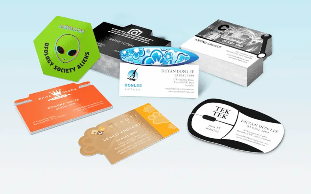
The next thing you need to decide on is the shape of your business card. The standard Business Card shape is a rectangle. You don’t have to stick to that. You can try different shapes that suit your brand and style. For example, you can go for a square, a circle, a hexagon, or even a custom shape that matches your logo or product.
Choosing the right shape can help you create a unique and memorable business card that reflects your brand identity and personality. It can also help you stand out from the competition and catch your audience’s attention.
However, before you choose a shape, make sure that it’s practical and convenient. You don’t want to create a shape that is too weird or complex that it won’t fit in a standard card holder or wallet. You also want to make sure that it’s easy to read and handle.
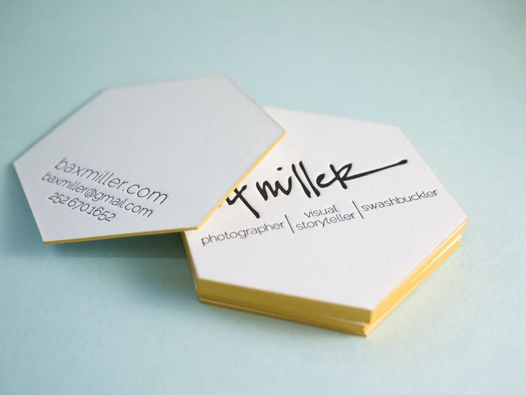
See below an example of a custom-shaped business card. This business card has a hexagon shape as well. It’s unique and eye-catching and it stands out from the crowd. It also uses the space efficiently and effectively for the information and design elements.
Tip 3: Pick the Right Colors
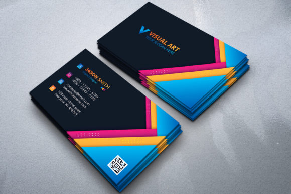
The next thing you need to consider is the colors of your business card. The colors can affect how your card looks and feels in your hand. They can also communicate your brand message, mood, tone, and personality.
Therefore, you should pick colors that match your brand identity and industry. For example, if you want to show trust, professionalism, and reliability, you can use blue, gray, or black colors. If you want to show creativity, fun, and innovation, you can use bright colors.
Picking the right colors can help you create a consistent and coherent business card that conveys your brand message clearly and effectively. It can also help you create a visual impact and appeal to your audience’s emotions.
However, make sure that your colors are distinct and consistent, and contrast well with each other. Ensure you use colors that are clear and go well together, so your audience won’t get confused or bored. Also, make sure the colors stand out from the foreground and background, so they won’t be hard to see or read.
If you pick the wrong colors, you might end up with a business card that is messy, noisy, or boring. You might also lose some credibility or trustworthiness in the eyes of your audience.
If your business card uses too similar colors that blend with each other, it will look dull and bland. It will also make it hard to see and read the information on the card.
Your business card can be of two contrasting colors that complement each other, or three analogous colors, it will make it look clean and elegant. It will also make it easy to see and read the information on the card.
Tip 4: Pick the Right Fonts
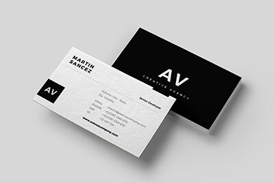
The next thing you need to consider is the font of your business card. The fonts can affect how your card looks and feels in your hand. They can also communicate your brand message, mood, tone, and personality.
Therefore, you should pick fonts that match your brand identity and industry. For example, if you want to show trust, professionalism, and reliability, you can use serif fonts or sans-serif fonts. If you want to show creativity, fun, and innovation, you can use script fonts or decorative fonts.
Picking the right fonts can help you create a consistent and coherent business card that conveys your brand message clearly and effectively. It can also help you create a visual impact and appeal to your audience’s emotions.
However, make sure that your fonts are clear, and consistent, and contrast well with each other. You don’t want to use too many fonts or too similar fonts that will confuse or distract your audience. You also don’t want to use fonts that are too small or too fancy that they will be hard to see or read.
You should limit yourself to two or three fonts at most, but more importantly, they need to go well one another. Fonts that are too different can be jarring and lose the sense of unity you want your business card design to have.
Tip 5: Include the Essential Information
Your business card should include the essential information that your audience needs to know about you and your brand. This may vary depending on your industry and purpose, but generally speaking, you should include:
- Your name
- Your title or position
- Your company name and logo
- Your contact details (phone number, email address, website URL)
- Your social media handles (optional)
- Your tagline or slogan (optional)
Including the essential information can help you create a useful and informative business card that provides your audience with everything they need to know about you and your brand. It can also help you create a connection and a relationship with your audience.
However, make sure that your information is clear, concise, and easy to read. Avoid using too many words or too small fonts that may clutter your card or make it hard to scan.
If you include too little or too much information, you might end up with a business card that is useless or overwhelming. You might also miss some opportunities or lose some interest from your audience.
Tip 6: Add Some Personality and Creativity
One of the best ways to make your business card stand out is to add some personality and creativity to it. You can do this by using some elements that showcase your unique value proposition, style, or story. For example, you can use:
- A catchy phrase or a quote that summarizes your brand message or mission
- A photo or an illustration that represents your product or service
- A QR code or a NFC chip that links to your website or portfolio
- A call-to-action that invites your audience to take the next step
Adding some personality and creativity can help you create an engaging and interactive business card that showcases your brand identity and personality. It can also help you create a memorable and irresistible business card that encourages your audience to keep it or contact you.
However, make sure that your elements are relevant, appropriate, and consistent with your brand. You don’t want to use elements that are irrelevant, inappropriate, or inconsistent with your brand. You also don’t want to use elements that are too gimmicky or cheesy that they will turn off your audience.
If you add elements that are irrelevant, inappropriate, or inconsistent with your brand, you might end up with a business card that is confusing, misleading, or unprofessional. You might also damage your brand image or reputation in the eyes of your audience.
Ensure your QR code links to your website, and do not use a photo that is inappropriate and offensive for a professional setting.
Conclusion
In this article, we have shared some business card design tips that can help you create a card that gets noticed and remembered. Your business card is a powerful marketing tool that can showcase your brand, personality, and value proposition. It can make a great first impression on your potential clients, customers, or partners. It can also help you stand out from the crowd and attract more business.
By following these tips, you can create a business card that reflects your brand identity and communicates your brand message clearly and effectively.
If you need help with designing your business card, you can lampmediatouch today. We are a team of professional business card designers who can create a custom and unique business card for you. We can also help you with printing, distributing, and updating your business cards.
Don’t miss this opportunity to create a memorable and irresistible business card. Contact us today and get started on your business card design project.

