Table of Contents
Graphic design is a field that requires creativity, attention to detail, and a strong sense of aesthetics. Whether you are a beginner or an experienced designer, mastering graphic design requires dedication, practice, and a deep understanding of the principles that govern the field.
In this ultimate guide, we will explore 10 powerful graphic design principles. By understanding and applying these principles, you will be able to create stunning designs that communicate your message effectively and leave a lasting impression on your audience.
Graphic Design Principles
Know your audience

To create designs that resonate with your audience, you must first understand who they are, what they like, and what motivates them. Ask yourself:
- Who is your target audience?
- What are their demographics, interests, and behaviors?
- What are their pain points and aspirations?
- How can your design help them achieve their goals?
- By answering these questions, you can create designs that speak directly to your audience and resonate with them on a deeper level.
Use visual hierarchy


Visual hierarchy is the arrangement of visual elements in a way that guides the viewer’s eye through the design. By using visual hierarchy effectively, you can create designs that are easy to understand and navigate.
- Use size, color, and contrast to create a clear visual hierarchy
- Place the most important elements in the most prominent positions
- Use visual cues like arrows and lines to guide the viewer’s eye
Keep it simple
Simplicity is key in graphic design. A simple design is easier to understand, remember, and communicate. Here’s how to keep your design simple:

- Eliminate unnecessary elements
- Use white space to create breathing room
- Stick to a limited color palette
- Use simple shapes and typography
Balance your design

Balance is essential in graphic design. A balanced design is visually pleasing and communicates a sense of harmony. Here’s how to create balance in your design:
- Use symmetry or asymmetry to create balance
- Use color and contrast to balance your design
- Use the rule of thirds to create balanced compositions
There are several components of balance.
Use color effectively

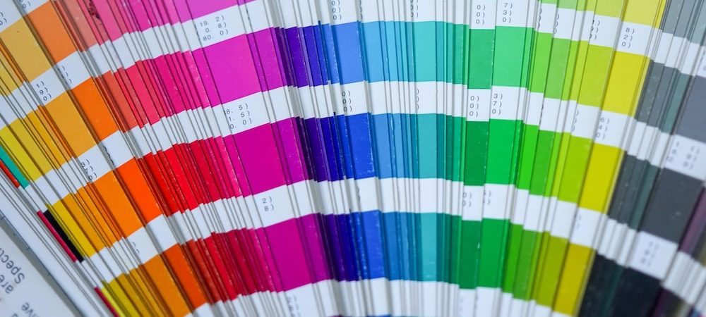
Color is a powerful tool in graphic design. It can evoke emotions, communicate meaning, and create contrast. Here’s how to use color effectively:
- Choose colors that complement each other
- Use color to create hierarchy
- Use color to create contrast and emphasis
Choose the right typography

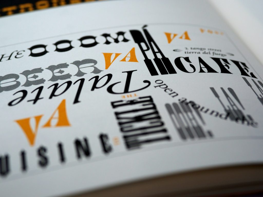
Typography is the art of arranging type to make written language legible, readable, and appealing. Here’s how to choose the right typography for your design:
- Choose a font that matches the tone and message of your design
- Use typography to create hierarchy and contrast
- Use typography to create visual interest and appeal
Use white space

White space, also known as negative space, is the space between design elements. Here’s how to use white space effectively:
- Use white
space to create a sense of balance and harmony - Use white space to draw attention to important elements
Use white space to create breathing room and avoid clutter
Create contrast

Contrast is the difference between two or more visual elements in a design. By creating contrast, you can create visual interest and draw attention to important elements. Here’s how to create contrast:
Use color contrast to create emphasis
Use size contrast to create hierarchy
Use font contrast to create visual interest
Pay attention to details

Details matter in graphic design. A well-designed design is one that pays attention to the smallest details. Here’s how to pay attention to details:
Check for spelling and grammar errors
Make sure your design is aligned and consistent
Use high-quality images and graphics
Pay attention to typography details such as kerning and leading
Practice, practice, practice
The more you practice, the better you will become at graphic design. Here’s how to practice:
Take on design challenges and projects
Analyze and critique other designs to learn from them
Experiment with different design styles and techniques
Seek feedback from other designers and clients
Q: What software should I use for graphic design?
A: There are many software options available for graphic design, including Adobe Photoshop, Illustrator, and InDesign. Choose the software that best fits your needs and budget.
Q: Do I need to have a degree in graphic design to become a successful designer?
A: No, you don’t need to have a degree in graphic design to become a successful designer. However, it can be helpful to have a formal education in design or a related field.
Q: How can I improve my creativity as a designer?
A: To improve your creativity as a designer, try new things, experiment with different design styles, and look for inspiration in unexpected places. You can also take classes or workshops on creativity and design thinking.
Conclusion:
By applying these 10 powerful graphic design principles for mastering graphic design, you can take your design skills to the next level. Remember to keep your audience in mind, use visual hierarchy, keep it simple, balance your design, use color effectively, choose the right typography, use white space, create contrast, pay attention to details, and practice, practice, practice.
With dedication and practice, you can become a skilled and successful graphic designer.
Choose Lampmediatouch for professional graphic design and digital printing services. With a sure touch of creativity, our team will bring your vision to life using cutting-edge equipment and a commitment to excellence. Contact us today to learn more.


