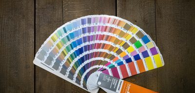
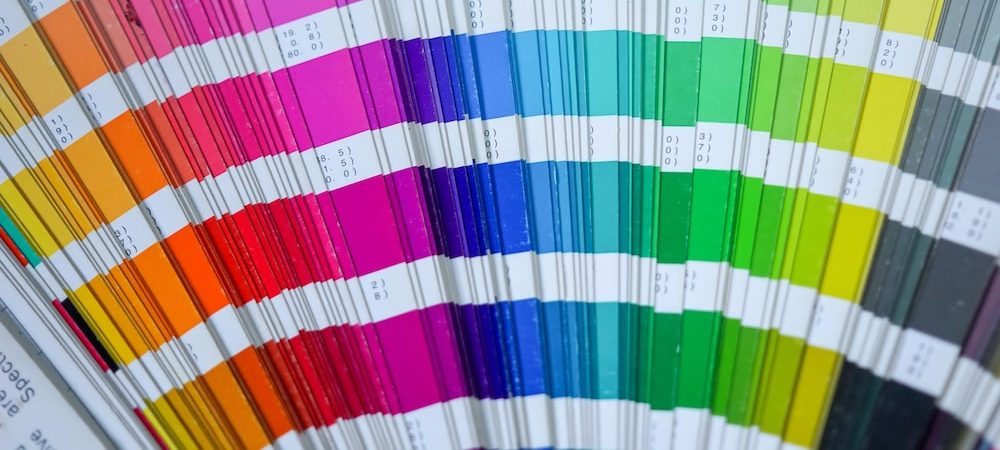
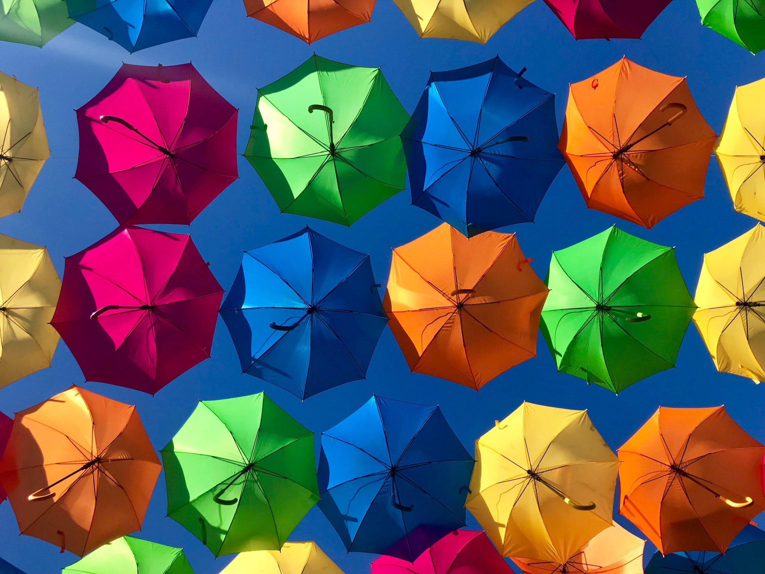
Color is an essential element in creating effective print designs for commercial products. Whether you’re designing packaging, advertising materials, or marketing collateral, color has the power to evoke emotions, influence purchasing decisions, and ultimately drive sales. But with so many colors to choose from and endless combinations, how do you know which colors to use and how to use them effectively? That’s where color theory comes in.
In this article, we’ll explore the role of color theory in creating effective print designs for commercial products. We’ll discuss the psychology of color, color combinations, and how to use color to evoke emotions and drive sales. So let’s dive in!
The Psychology of Color in Color Theory:
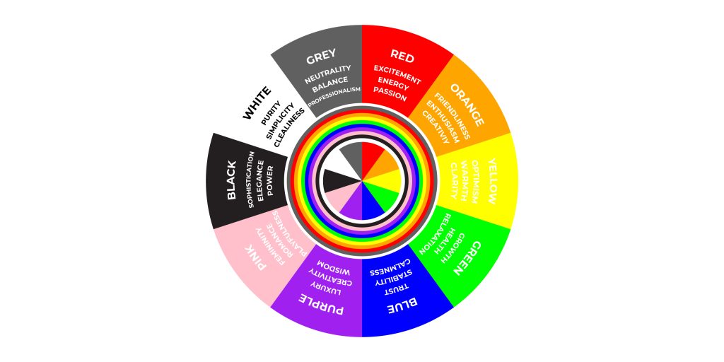
Color psychology is the study of how colors affect human behavior and emotions. Color has a powerful psychological impact on our emotions and behavior. Different colors evoke different emotions and can influence how we perceive a product or brand. Understanding the psychology of color is essential when designing print materials for commercial products.
Here are some common emotions associated with different colors:
| Red: | Passion, excitement, energy, urgency |
| Orange: | Friendliness, enthusiasm, creativity |
| Yellow: | Optimism, warmth, clarity |
| Green: | Growth, health, relaxation |
| Blue: | Trust, stability, calmness |
| Purple: | Luxury, creativity, wisdom |
| Pink: | Femininity, romance, playfulness |
| Black: | Sophistication, elegance, power |
| White: | Purity, simplicity, cleanliness |
| Gray: | Neutrality, balance, professionalism |
Color Combinations in Color Theory:
Choosing the right color combinations is essential when creating effective print designs for commercial products. Certain color combinations can create a powerful impact and evoke specific emotions.
Here are some common color combinations and the emotions they evoke
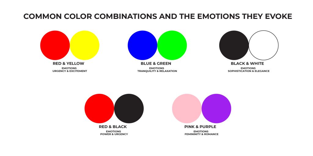
Red and yellow: Creates a sense of urgency and excitement, often used for clearance sales or limited-time offers.
Blue and green: This creates a sense of tranquility and relaxation, often used for health and wellness products.
Black and white: Creates a sense of sophistication and elegance, often used for luxury products or high-end brands.
Red and black: Creates a sense of power and urgency, often used for sports brands or products.
Pink and purple: This creates a sense of femininity and romance, often used for beauty and fashion products.
Using Color to Evoke Emotions:

Using color strategically can help you evoke specific emotions in your target audience. Here are some tips on how to use color to evoke emotions:
Consider your target audience
Different colors may evoke different emotions depending on your target audience. For example, children may respond differently to colors than adults.
Use contrasting colors
Contrasting colors can create a powerful impact and draw attention to your product or brand.
Use color accents
Using a pop of color can create a focal point and draw attention to a specific area of your design.
Keep it simple
Too many colors can be overwhelming and confusing. Stick to a few main colors to create a cohesive and effective design.
Using Color to Drive Sales

Using color strategically can also help you drive sales and increase revenue.
Here are some tips on how to use color to drive sales:
Use color to highlight important information
Using color to draw attention to important information, such as discounts or limited-time offers, can increase conversions.
Use color to create a sense of urgency
Red and yellow are often used to create a sense of urgency and drive impulse purchases.
Use color to create a brand identity
Consistent use of color can help create a strong brand identity and increase brand recognition.
Use color to differentiate from competitors
Using a unique color palette can help your product stand out from competitors and attract attention.
How many colors should I use in my design?
It’s best to stick to a few main colors to create a cohesive and effective design. Too many colors can be overwhelming and confusing.
Can color really influence purchasing decisions?
Yes, color has a powerful psychological impact on our emotions and behavior, and can influence how we perceive a product or brand.
Should I consider cultural differences when choosing colors?
Yes, it’s important to consider cultural differences when choosing colors, as different colors can have different meanings in different cultures.
Conclusion:
In conclusion, color theory plays a crucial role in creating effective print designs for commercial products. By understanding the psychology of color, choosing the right color combinations, and using color strategically, you can evoke specific emotions, drive sales, and create a strong brand identity. So the next time you’re designing print materials for your commercial products, don’t forget the power of color!
Looking to create eye-catching print designs that capture the attention of your target audience? Look no further than LampMediaTouch, your go-to graphic design and digital printing hub!
Our team of experienced designers and printing experts understands the importance of color theory in creating effective designs that drive sales and establish a strong brand identity. With our expertise, we can help you choose the right color combinations and use color strategically to evoke specific emotions and create a lasting impression on your customers.
So why settle for mediocre designs that fail to stand out in a crowded market? Choose LampMediaTouch for your next design project and experience the power of color for yourself. Contact us today to get started!

