Do you want to create print materials that look amazing and match your industry, niche, and audience? If so, you must pay attention to your fonts, colors, and design. They can make or break your print product.
At LAMPMEDIATOUCH, we can help you with that. We are a graphic design and digital printing company that knows how to make your print materials look professional and appealing. We have seen many printable files from our clients. Some of them are well-designed and ready to print. Others need some improvement or revision.
One of the common problems we face is when the fonts, colors, and design of the file do not suit the industry or niche of the client. For instance, we once had a client who wanted to print an outdoor banner for his gaming store. But his file was not good. It had low-quality images, comic-related fonts, and poor text and background contrast. He also used red and blue colors, which made the text hard to read. His file did not look like it was for a gaming store. It did not attract gamers.
We told him to change his file. We told him to use high-quality images, fonts more suitable for gaming, and colors and contrast that made the text more visible and attractive. We also gave him some design tips and best practices to help him make a better banner for his store.
In this article, we will share some of these tips with you. You can use them to choose the right fonts, colors, and designs for your printing projects.
Before you start designing, you need to think about these factors:
- The purpose of your print product: What do you want to achieve with your print product? Who is your target audience? What do you want them to do after seeing your print product?
- The industry or niche of your print product: What is the theme or topic of your print product? What are the common features or trends of your industry or niche? What are the expectations or preferences of your audience?
- The format and size of your print product: What is the shape or layout of your print product? How much space do you have to work with? How will your print product be displayed or distributed?
These factors will help you choose the fonts, colors, and designs that best suit your print product. Here are some general guidelines to follow:
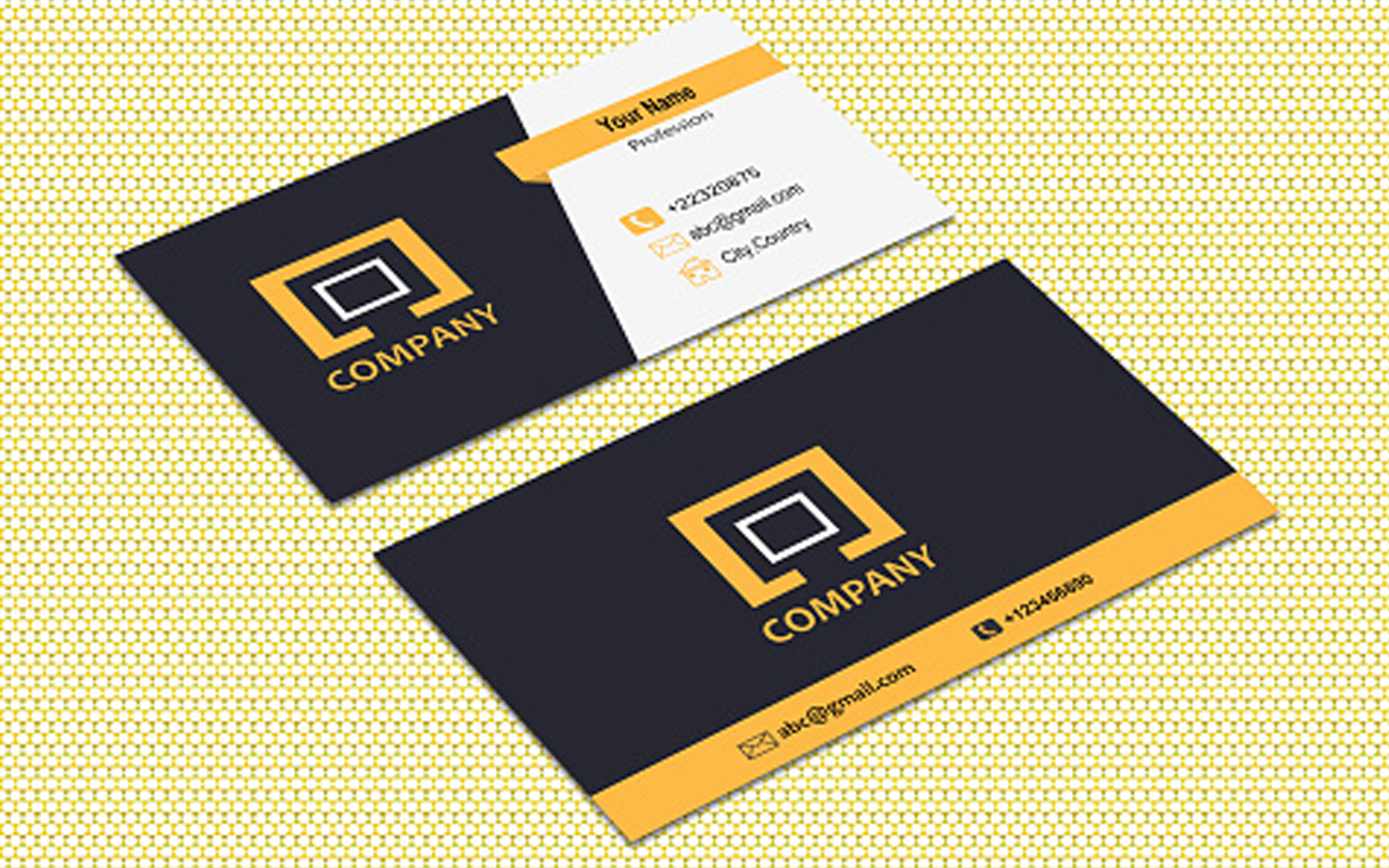
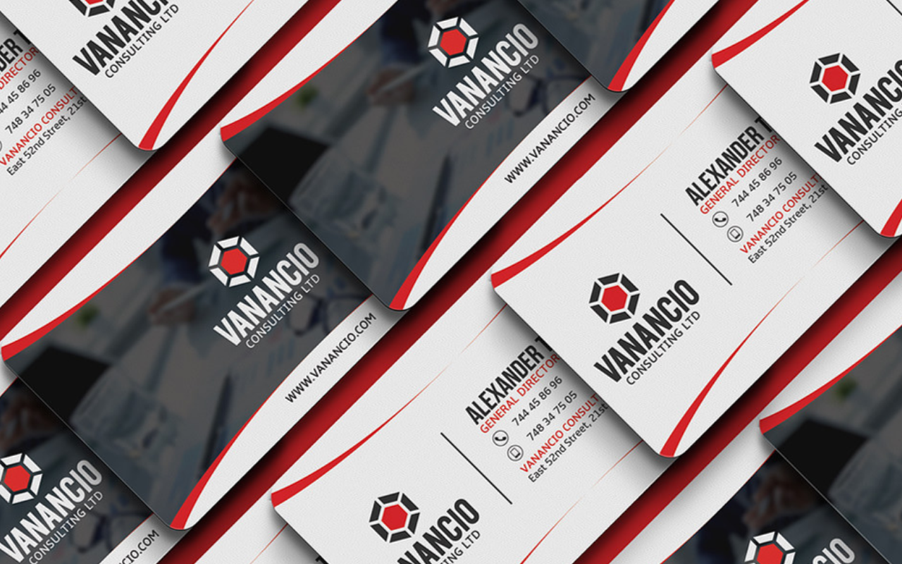
Fonts:
Use clear, legible, and appropriate fonts for your print product. Avoid using too many fonts or fonts that are too fancy or complex. Choose fonts that match the tone and style of your print product. For example, suppose you are designing a banner for a gaming store. You can use modern, bold and dynamic fonts like Herona, Plaguard, or Quentine.
Colors:
Use attractive, harmonious, and consistent colors for your print product. Avoid using too many colors or colors that clash or blend. Choose colors that contrast well with each other and with the background. For example, suppose you are designing a banner for a gaming store. In that case, you can use bright, vibrant, and energetic colors like orange, yellow, or green.
Design:
Use design elements that are simple, balanced, and relevant to your print product. Avoid using too many elements or elements that are distracting or irrelevant. Choose elements that enhance the message and appeal of your print product. For example, suppose you are designing a banner for a gaming store. In that case, you can use high-quality, eye-catching images related to gaming, such as logos, icons, or screenshots.
Conclusion
By following these tips, you can create print materials that are effective, professional, and appealing. You can also avoid common mistakes that ruin your print materials and waste time and money.
At LAMPMEDIATOUCH, we are always ready to help you with your graphic design and digital printing needs. We have the expertise, experience, and equipment to handle any printing project. Whether you need a banner, a flyer, a brochure, or any other type of print product, we can help you create it. Contact us today and let us know what you need. We will gladly assist you and provide you with a free quote.
We look forward to working with you and making your print materials look amazing.
FAQ:
What are some examples of fonts suitable for gaming banners?
Some fonts that are suitable for gaming banners are Impact, Arial Black, and Verdana. These fonts are modern, bold, and dynamic.
What are some examples of colors suitable for gaming banners?
Some colors suitable for gaming banners are purple, yellow, and green. These colors are bright, vibrant, and energetic.
What are some examples of design elements suitable for gaming banners?
Some design elements suitable for gaming banners are logos, icons, and screenshots. These elements are high-quality, eye-catching, and related to gaming