A logo is far more than a mere visual representation of your fashion business or company. It serves as a potent instrument for conveying your brand identity, personality, and values to your intended audience. A well-crafted logo possesses the potential to differentiate you from competitors, allure customers, and cultivate loyalty. But how does one create a logo that truly encapsulates your fashion style and vision? What vital elements should be included in a logo for a fashion business or company?
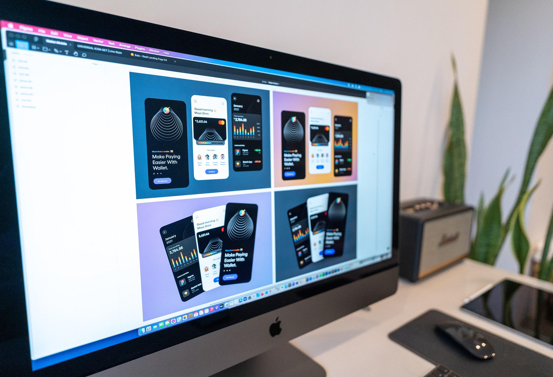
In this article, we will delve into best practices and insights for crafting a logo tailored to a fashion business or company. We’ll draw inspiration from prominent brands within the industry and spotlight how Lampmediatouch, a distinguished graphic design and digital printing platform, can assist in designing and producing your logo with unparalleled quality and professionalism.
As emphasized by Tailor Brands, a leading online logo maker, “Fashion logos help your customer create a connection to your brand. Unlike with other industry logos, your logo probably won’t be the first impression you make on your customers—the clothing or accessories are. However, your logo is a key part of creating a brand that brings back returning customers.” Thus, the design of your logo is paramount; it should harmonize seamlessly with your fashion products and resonate deeply with your clientele.
Key Elements of logo for a Fashion Business or Company:
Color: The choice of color holds immense power in conveying emotions and messages, be it elegance, passion, creativity, or fun. Opt for colors that harmonize with your brand’s narrative and character, aligning them with the design elements of your clothing. Choices encompass classic black and white, or the introduction of a vibrant hue for heightened distinction.
Layout: Layout governs the arrangement of logo components, such as text, icons, shapes, or symbols. Opt for a layout that’s uncluttered, adaptable, and versatile—ensuring your logo retains its appeal across diverse sizes and platforms. Additionally, consider crafting varied logo versions to suit distinct applications. It is still possible to adapt different layout for your logo, given your logo variety of usage opportunity., but overall you should choose a layout that allows you to create different variations of your logo without compromising its identity or consistency.
Typography: Typography influences how your brand name and message are communicated. Choose a font that’s legible, stylish, and aligns with your brand’s demeanor. Choice of fonts has gret impact on future applications or customization of your logo through effects like monogramming, embossing, foiling, or laminating.
Symbol: A symbol visually encapsulates your brand. It’s vital that this symbol resonates with your fashion style and engages your audience. This can include images, icons, or symbols connected to your products, or abstract forms that possess cultural or personal significance.
By skillfully blending these elements, you can create a logo that effortlessly captures the essence of your fashion business or company.
In the next sections, we will delve into each element more profoundly, drawing from examples set by industry giants. We’ll also furnish you with insights on enhancing the appeal and memorability of your logo.
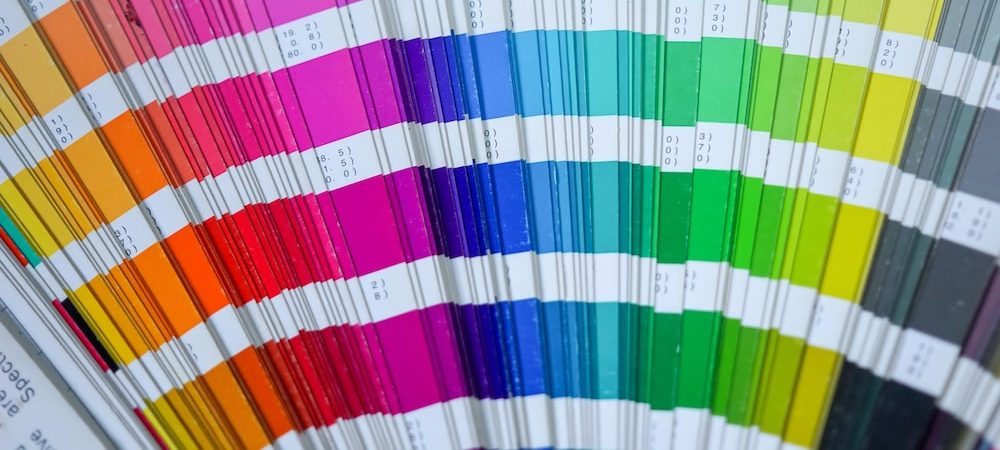
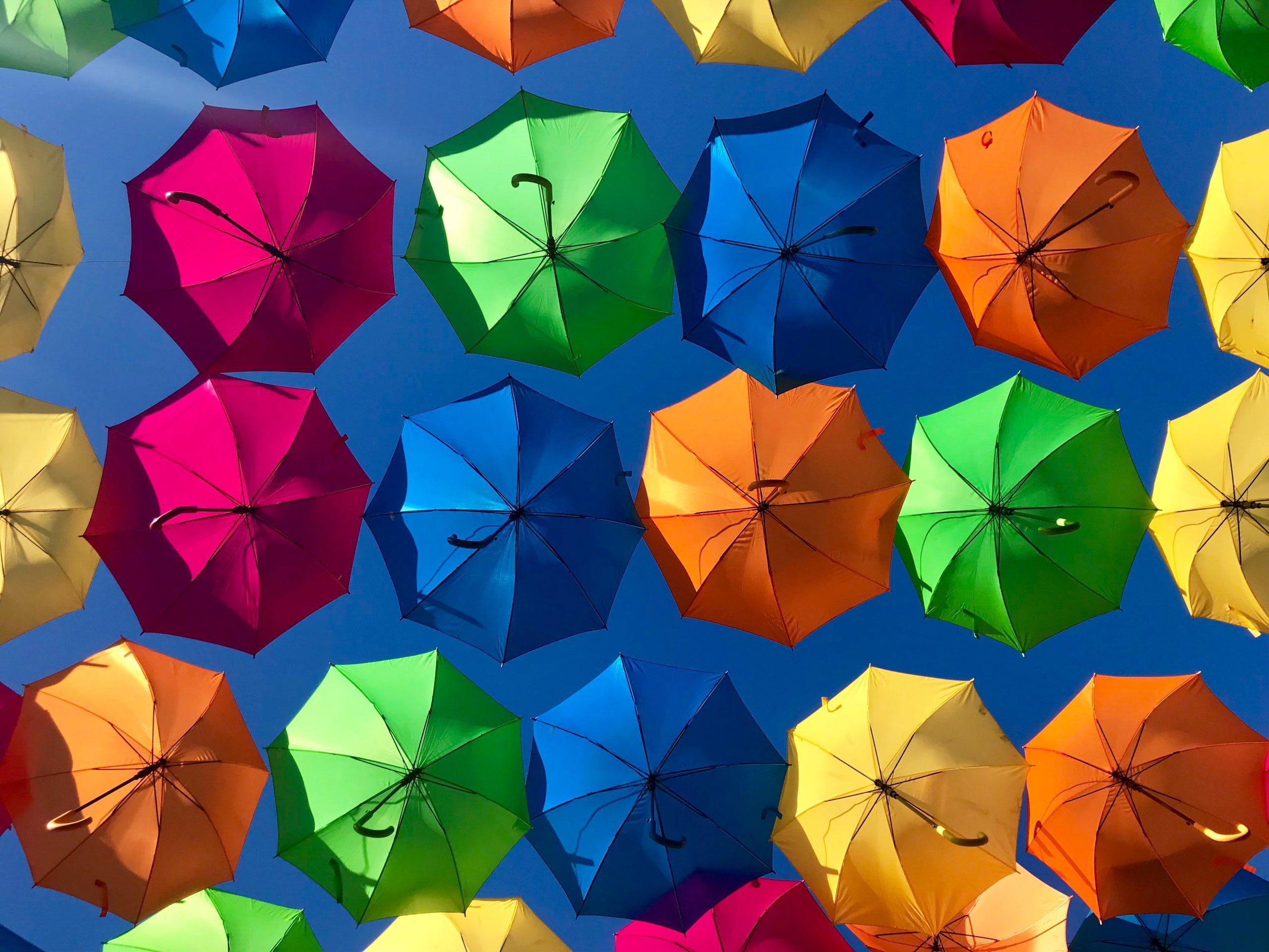
Color
Color is an instrumental component of a logo, capable of communicating emotions and messages. Your selection of color plays a pivotal role in establishing brand identity and connecting with your intended audience. Several factors warrant consideration:
- Your brand’s image and narrative: Opt for colors harmonizing with your brand’s personality, message, values, and vision.
- Your clothing design: Align color choices with the palette and style of your clothing line, ensuring cohesiveness.
- Target audience preferences: Opt for colors that resonate with your target demographic, matching their tastes and aspirations.
Prominent fashion brands adeptly wield color in their logos:
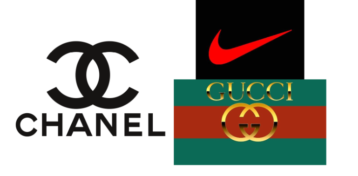
- Chanel: Epitomizing classic elegance, Chanel employs black and white to create an enduring, sophisticated contrast.
- Nike: Over the years, the swoosh used to be red and usually alternate with white color. Red stood for energy, passion, and joy and white expressed nobility, purity and charm of the brand.
- Gucci: Appearing on huge selection of vintage products is Gucci logo featuring dark green and red stripes which form a distinct and memorable combination, signifying beauty and class
Tips for infusing your logo with allure and memorability through color:
- Utilize a color wheel: Employ different color schemes—monochromatic, analogous, complementary, or triadic—to generate various effects.
- Embrace contrast: Employ contrasts to highlight specific logo elements or generate dynamic backgrounds.
- Leverage gradients: Gradients can infuse depth and dynamism, elevating your logo’s visual allure.
Layout
Layout significantly influences how your logo functions and appears across diverse media. An optimal layout is one that’s straightforward, adaptable, and capable of adapting to various contexts. Consider:
- Components of your logo: How do you intend to position text, icons, shapes, or symbols in relation to one another?
- Logo size: How will the logo appear across different platforms and mediums, from clothing labels to websites?
- Variations: Do you require various iterations of your logo for different applications?
Esteemed fashion brands exemplify effective logo layout choices
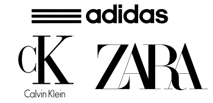
- Adidas: Employing horizontal layout for its full logo with text and three stripes makes the logo easy to identify.
- Calvin Klein: A vertical layout for the full logo with text and icon imparts sophistication.
- Zara: Zara’s full logo employs a simple horizontal layout for text, reflecting modern minimalism.
Tips for enhancing logo appeal through layout:
- Employ alignment: Different alignments—left, right, center, justified—create varied effects and structure.
- Embrace spacing: Spacing impacts readability; use it to ensure a balanced and impactful logo.
- Balance symmetry: Employ horizontal, vertical, radial, or bilateral symmetry to confer harmony and visual appeal.
Typography
Typography profoundly influences logo communication. A font choice should be clear, readable, stylish, and consistent with brand tone. Key considerations include:
- Brand name: The length, pronunciation, and memorability of your brand name should dictate font choice.
- Brand message: Typography should amplify your brand message and market positioning.
- Brand style: Opt for typography that resonates with your brand’s style and imparts uniqueness.
Esteemed fashion brands skillfully deploy typography
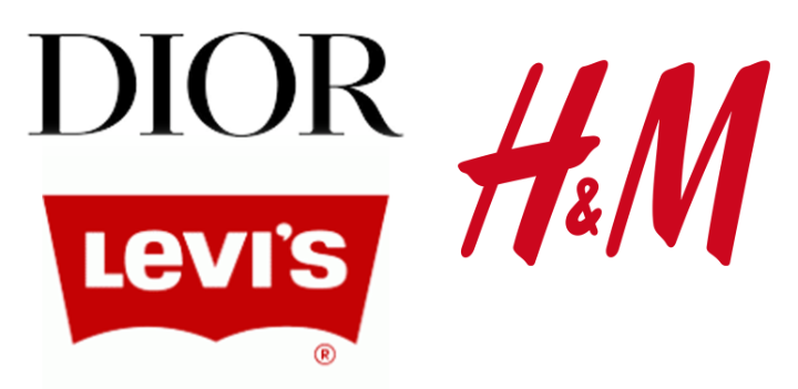
- H&M: Custom Minimalist sans fonts evoke modernity and affordability, while red accents convey energy and excitement.
- Dior: Elegant serif fonts exude luxury and exclusivity, complemented by a black color palette.
- Levi’s: A simple and modern sans-serif font, combined with a batwing-shaped symbol derived from the arcuate stitching on the back pockets of the jeans, creating a logo that is versatile and recognizable.
Tips for enhancing logo allure through typography:
- Custom fonts: Design custom fonts that lend your logo an exclusive and memorable character.
- Apply Styles: Styles such as italic, bold, or underline add variety and emphasis, making your logo more expressive and dynamic.
- Fine-tune with kerning: Kerning adjusts letter spacing for improved balance and harmony.
Symbol
A symbol encapsulates your brand’s essence visually. Its choice should resonate with your fashion style and engage your audience. Factors include:
- Brand name: Symbolic imagery should complement your brand name, imbuing it with memorability.
- Brand message: Symbols should align with your brand’s message and communicate its essence.
- Brand style: A symbol should reflect your brand’s unique style and essence.
Prominent fashion brands effectively wield symbolic elements in their logos
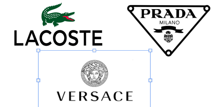
- Lacoste: A crocodile symbolizes Lacoste’s tenacity, aligning with the founder’s nickname on the tennis court.
- Prada: A triangle emblem alludes to Prada’s original luggage tag shape, signifying stability and sophistication.
- Versace: The Medusa head denotes power, beauty, and allure, anchoring Versace’s visual identity.
Tips for enriching logo allure through symbols
- Embrace simplicity: Simple shapes—circles, squares, triangles—can create immediate impact and recognition.
- Harness negative space: Negative space can imbue your logo with hidden meanings or dynamic effects.
- Experiment with abstraction: Abstract symbols can evoke intrigue and emotion, enriching your logo’s appeal.
Conclusion:
Designing a logo for a fashion business or company is a journey that melds creativity with strategic branding. It’s a pivotal step in forging a distinctive identity, one that resonates with your audience and encapsulates your style. Following the insights and best practices we’ve shared, you’re well-equipped to create a logo that aligns with your aspirations.
For guidance and support in crafting and producing logo for a fashion business, look no further than Lampmediatouch. Our platform combines expertise and technology to ensure your logo resonates powerfully on every medium. Visit our website lampmediatouch.com, and engage our graphic design and digital printing services to bring your logo to life.
Contact us today for a quote, and rest assured that our commitment to quality and service will exceed your expectations. Let us partner with you to create a logo that truly shines and leaves an indelible mark.
Can I mix and match colors to create a unique logo palette?
Absolutely! Combining colors can result in a distinctive and attention-grabbing logo. Just ensure the chosen colors harmonize and effectively convey your brand’s vibe.
How can I maintain logo legibility while experimenting with typography styles?
While trying styles like italic, bold, or underline, balance is key. Make sure your chosen style doesn’t compromise readability, maintaining a clear connection with your brand message.
What’s the secret behind an impactful logo layout?
The magic lies in adaptability. Opt for a flexible layout that effortlessly transitions from clothing labels to digital media, ensuring your logo’s impact remains consistent.
Is it possible to blend modernity and tradition using logo symbols?
Absolutely! By incorporating symbols that resonate with your fashion style while infusing modern elements, you can create a logo that pays homage to tradition while staying current.